


KEYTAKEAWAYS
- Market expectations matter more than actual cuts: The deviation between Fed rate cut outcomes and priced-in expectations drives real volatility, not nominal rates themselves.
- Three tools reveal Fed rate cut trajectory: CME FedWatch shows magnitude probabilities, dot plots reveal official intent, and yield curves indicate professional traders' pace expectations.
- Bear steepener signals slow cuts ahead: Current 10Y-2Y yield curve shows preventive Fed rate cuts with gradual pace, limiting immediate liquidity for risk assets.
CONTENT
Learn to decode Fed rate cut signals beyond tonight’s FOMC meeting using CME FedWatch, dot plots, and yield curves to track magnitude and pace of cuts.
As markets brace for the upcoming Federal Open Market Committee (FOMC) meeting tonight, one crucial truth often gets overlooked: rate cuts themselves are typically already priced in. What truly drives market volatility isn’t the cut itself—it’s the deviation between actual outcomes and market expectations.
I’ve emphasized before that when it comes to rate cuts, what matters more than the nominal rate is the real interest rate, along with the magnitude and pace of cuts. These two factors are the key signals driving asset movements.
Today, I’ll walk you through how to capture these signals through data—taking you from a casual observer to someone who can see beyond the surface and understand what’s really driving the market.
Understanding Fed Rate Cut Signals: Tracking Pace and Magnitude
1. Market Expectation Gap: CME FedWatch Tool for Fed Rate Cut Probabilities
This is the most intuitive tool for quantifying rate cut magnitude. It calculates probabilities based on federal funds futures prices.
The key here isn’t just whether the Fed will cut at the next meeting—it’s understanding the probability distribution.
If markets originally expected a 25 basis point (bp) cut, but the FedWatch shows the probability of a 50bp cut surging from 10% to 40% within days, it signals the market is pricing in a “recession narrative” with increased magnitude, and volatility will spike dramatically.
Each shift in rate cut expectations creates waves across markets. As I mentioned earlier, rate cuts are often already priced in—what truly drives sharp price movements is the deviation between actual outcomes and market expectations.
Pay close attention to the magnitude of changes in market expectations across different rate cut ranges, as shown in the chart. These expectations are ultimately driven by U.S. employment and inflation data.
https://www.cmegroup.com/markets/interest-rates/cme-fedwatch-tool.html
2. Official Fed Rate Cut Intent: The Dot Plot
The dot plot is released quarterly, showing 19 Federal Reserve officials’ individual projections for future interest rates.
What we need to examine is the dispersion of the dots and changes in the median.
If the dot plot shows the median rate for end-2026 has moved significantly lower compared to the previous quarter, it indicates the Fed has raised its collective “ceiling” for rate cuts—a bullish endorsement for the long term.
Both the dot plot and the market expectation gap above help us gauge the magnitude of rate cuts.
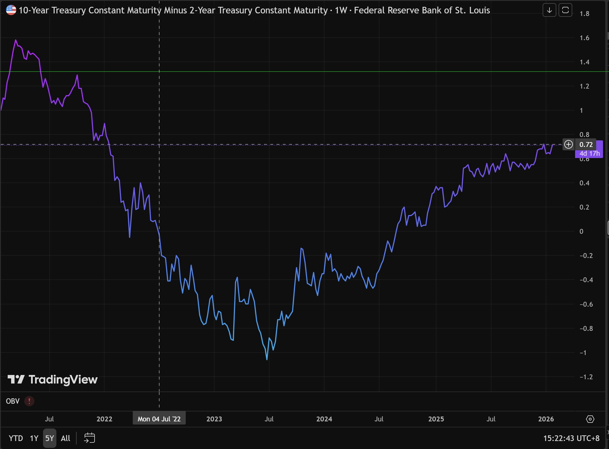
3. Fed Rate Cut Pace: 10Y-2Y Treasury Yield Curve Analysis
The 10Y-2Y Treasury yield curve reveals what professional bond traders think about the pace of cuts.
The principle is straightforward:
- 2Y represents policy rates for the next two years, directly controlled by Fed rate actions
- 10Y represents long-term economic growth and inflation expectations
What’s the current situation? We’re now in the “inversion unwinding” phase (10Y rates are beginning to rise above 2Y again, or the gap between them is narrowing).
https://www.tradingview.com/chart/O9lEPyjs/?symbol=FRED%3AT10Y2Y
Understanding Yield Curve Inversion
Normally, because of longer duration and greater risk, long-term bonds should yield more than short-term bonds. If 2Y rates exceed 10Y rates, that’s called inversion—a signal of potential recession.
This phenomenon occurs when markets see current inflation as too high or the Fed aggressively hiking rates, causing short-term financing costs to spike. The 2-year yield tracks policy rates closely.
Meanwhile, on the 10-year side, traders believe that because current rates are so high, the economy will eventually be “crushed.”
When the economy weakens, future inflation will disappear, and the Fed will ultimately be forced into aggressive rate cuts. So investors rush to buy long-term bonds to lock in current yields.
With more buyers, 10-year Treasury prices rise, causing yields to drop.
That’s why we can see from the chart that the 10Y-2Y yield curve was previously inverted, moving from -1.04 in 2023 to the current 0.57, gradually unwinding the inversion.
How to Interpret Fed Rate Cut Signals from Yield Curve Unwinding
Looking at the 10Y-2Y Treasury yield curve, the trend is upward, but the distinction lies in what’s driving the increase.
Remember this formula: 10Y-2Y
Bull Steepener — Fast rate cuts, positive for liquidity
- Spread chart behavior: Curve steepens dramatically, surging upward rapidly
- What’s really happening: 2-year yields (short end) are falling much faster than 10-year yields
- Market logic: Economic data is weak, and markets are confident the Fed will cut rates aggressively and quickly
Bear Steepener — Slow rate cuts/inflation resurgence, negative for liquidity
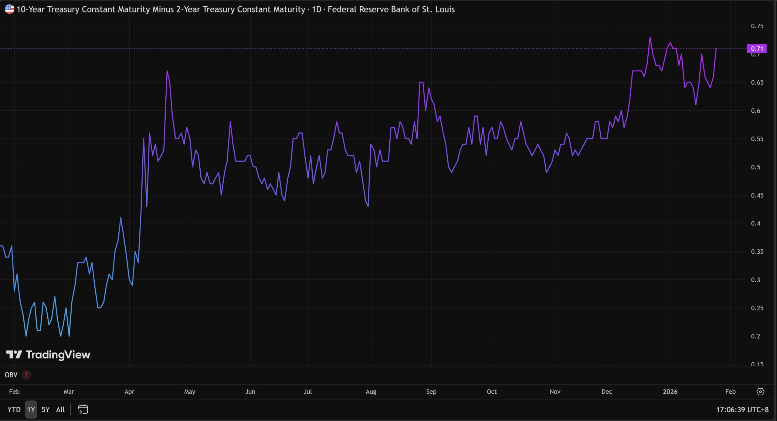
- Spread chart behavior: Curve rises slowly or fluctuates upward repeatedly (like the choppy movement in early 2026 shown in the chart)
- What’s really happening: 10-year yields (long end) are rising while 2-year yields either rise or fall very slowly
- Market logic: Markets worry about inflation rebounding (re-inflation narrative), or believe the economy is too strong for the Fed to need rate cuts
Clearly, we’re currently in a bear steepener phase. Looking at the 10Y and 2Y curves separately, their 5-year trends show both have been rising recently.
This means current rate cuts lean toward “preventive cuts”—the Fed is cutting gradually, like squeezing toothpaste, cutting a bit then pausing.
When Will Markets See True Fed Rate Cut Impact?
When the 10Y-2Y yield curve can steepen more dramatically, that’s when crypto markets will see liquidity and assets can truly take flight.
When liquidity is injected, that’s when sector narratives emerge to ignite the market.
Narratives are just the surface—the narrative can be any sector, just an actor pushed onto the stage. What matters is how many paying audience members are watching from below.
Why Gold Is Surging: Central Banks, Sanctions, and Trust-1
Gold Front-Runs QE as Bitcoin Waits for Liquidity-2
CURRENT INTERST RATE SITUATION
The current effective federal funds rate is 3.72%. As shown in the chart below, from March 2022 to August 2023, the Federal Reserve consistently raised interest rates.
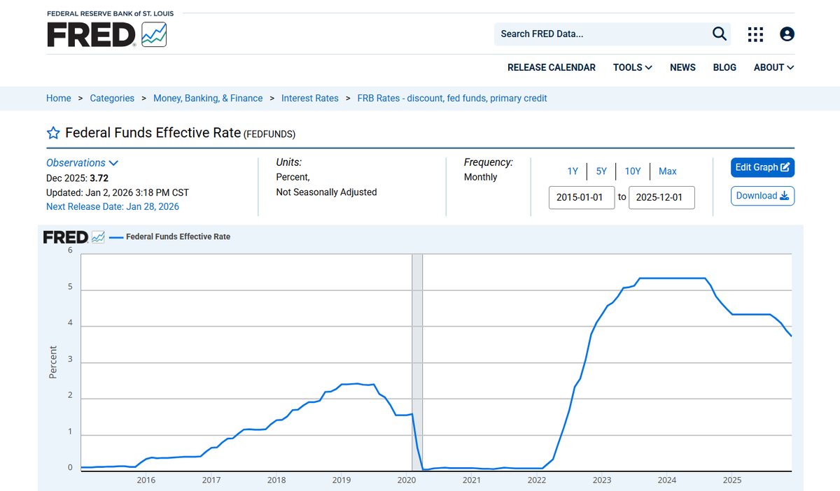
Then interest rates remained stable until August 2024 when rate cuts began. This effective federal funds rate is the rate referred to in each Fed meeting’s rate cut.
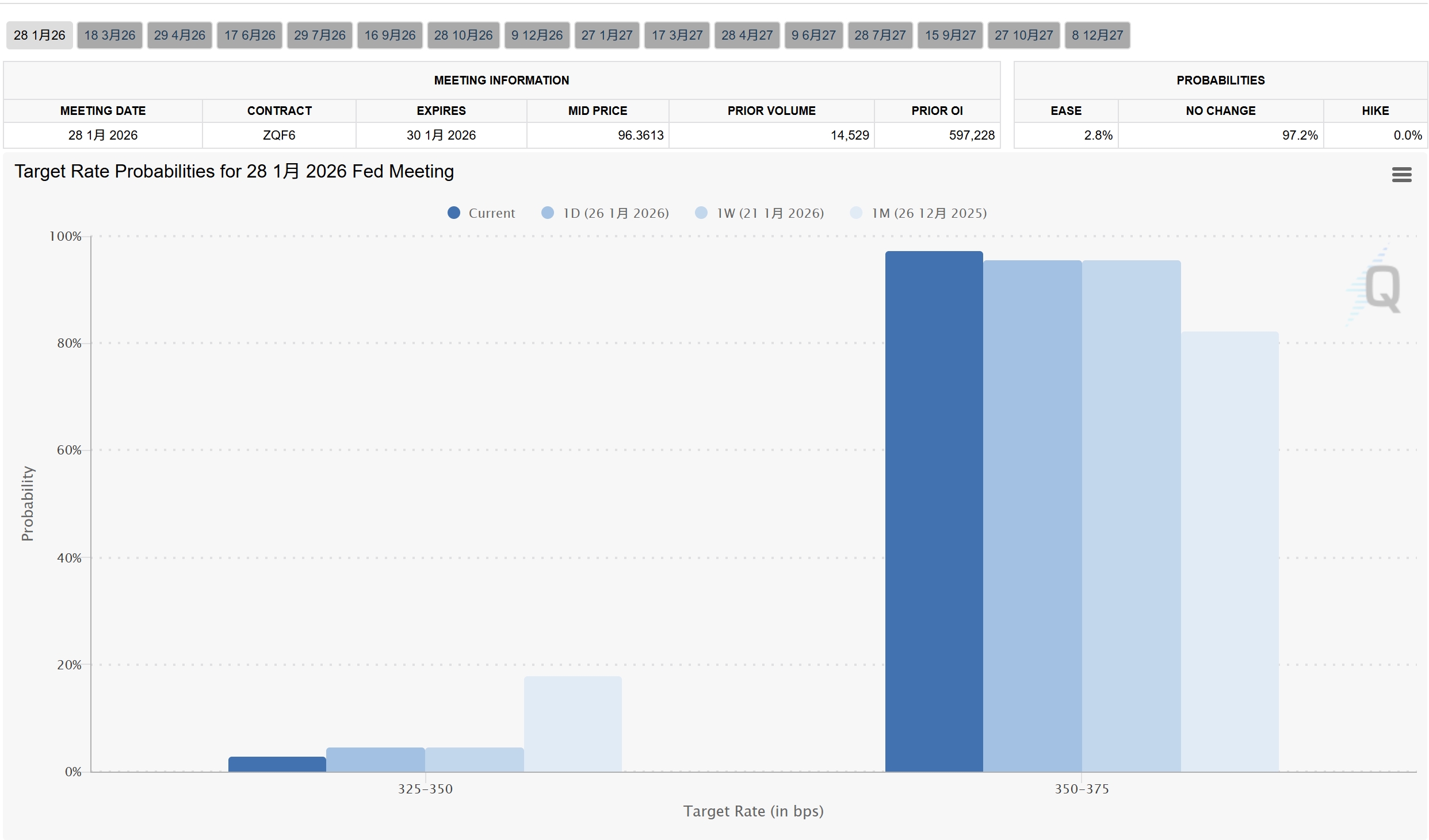
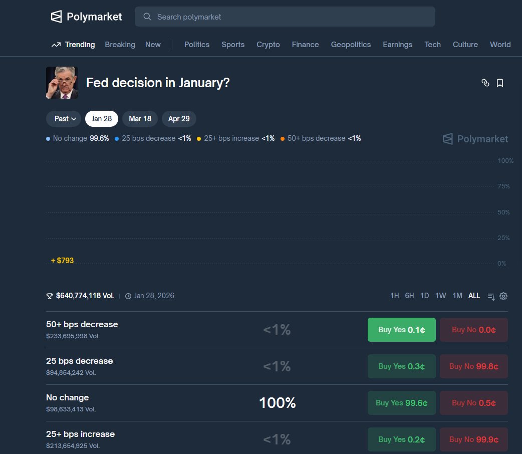
However, current market predictions indicate a 97.2% probability of no rate cut this time. This was already priced in during the market crash of the past two days. As for how the market will react after the FOMC meeting,
assuming expectations are met, it will depend on Powell’s tone in his speech—whether he leans hawkish or dovish.
Market volatility will be entirely driven by Fed Chairman Powell’s words.
How to distinguish between hawkish and dovish? Common phrases include:
Regarding employment:
Expressing concern about rising unemployment, hinting at protecting the economy, or believing the job market remains strong and there is no need to rush into rate cuts.
On inflation: He acknowledges that inflation is approaching the 2% target or emphasizes that inflation remains resilient, expressing concern about a rebound.
Future path:
He hints at further rate cuts in March or June or emphasizes “Higher for Longer” (maintaining high rates for longer), even stating that further rate hikes are not ruled out.
Based on Powell’s past performance and recent US economic data, I predict his speech will be “neutral to hawkish.”
Because Powell’s term is about to end, maintaining the status quo is likely the best option for him. Given the current dilemma facing the US, it’s better to leave decision-making power to the next administration.
If he suddenly acts extremely at this time, he will inevitably suffer a bad reputation. His primary task is a smooth handover of power.
He is highly unlikely to commit to a further rate cut in March; he will refuse to commit!
If this is indeed the case, BTC and the entire crypto market may face another round of bottoming out.
Gold, which has already risen to $5200, may continue to attract safe-haven funds.
PREDICTION MARKETS
One advantage of prediction markets is that they allow us to observe the game dynamics on a single event through order books.
Now, whether it’s macroeconomic interest rates or other events, I habitually check the odds and identify high-win-rate players, especially professionals focused on a particular market.
Monitoring their addresses aids in decision-making.
Firstly, regarding whether there will be an interest rate cut in January, even though the result hasn’t been announced yet, the probability on PL is already 100%.
Another noteworthy factor is the number of people voting against it.
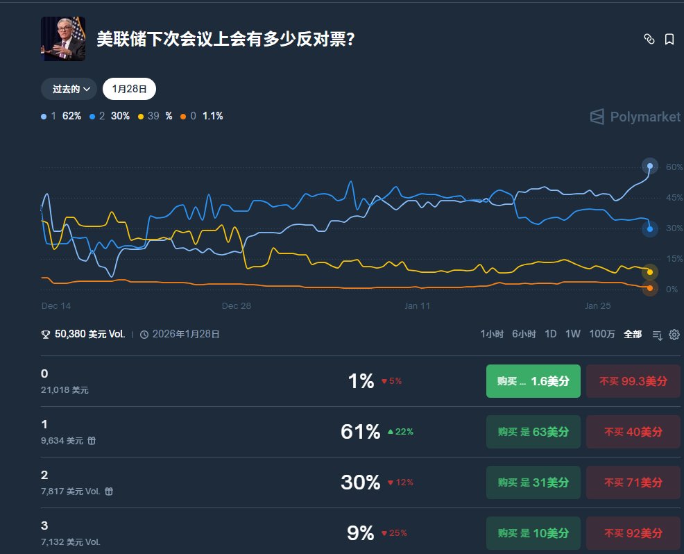
The probability of one vote is 61%, likely from Miran, given her consistent advocacy for a rapid and significant rate cut.
If there are two single votes, it’s likely from Schmid or Waller, both of whom are hawkish.
If two votes are cast, one likely for and one against, the market will likely see more funds flowing into gold and less into BTC due to uncertainty.
Therefore, I lean towards a bearish outlook for this FMOC meeting.
The above viewpoints are referenced from Ace